
Project Objective
The objective of this project was to create a brand and website for myself to start a small business after I graduate promoting different products including an apparel line and making a commission off of what is sold. Many websites today provide their audiences with information on different products with discounts and codes to make an income. Other websites provide a shop or store for their audience to make purchases from and provide owners with an income. My goal is to have a website that is a one-stop site for women between the ages of 18 to 30 years old that provide both information on products with discounts and codes and a store for them to shop from online.


Firstly, I created a style guide that indicates the color scheme, typography, audience, tagline, icons, photography, and logo of the brand through Adobe Illustrator. According to Color Psychology (http://www.artitudesdesign.com/purple-color-psychology/), “Often associated with luxury, power, wisdom, creativity, and magic, purple is the balancing color between red and blue’s color psychologies. While red brings intensity and energy to the color, blue brings relaxation and stability, and together they make purple the perfect balance of the two. Color Psychology says that it “can have calming effects over the mind and nerves, it can be uplifting and can trigger creativity…Light purple has a more feminine energy, bright purple is associated with richness and royalty, and dark purple represents sadness and frustration.” I chose a purple monochromatic color scheme from Pantone that will be used according to the seasons of the year. Fall, winter, spring, and summer to change along with the fashion season. Since it’s currently summer, the website and logo are used with the #CDAEC9 hue as it’s main color and #AA99AA as it’s secondary hue for box shadows and typography.

Secondly, I spent about 4 hours working on typography, spending about half of that time searching for the right serif and sans serif that aesthetically goes together. I used Adobe Type Fonts to search for fonts that would be simply elegant, modern, and easy to read for viewers. A few typography’s I tested include
DECORATIVE
-
Adorn – 4 font styles
-
Sloop Script – 12 font styles
SERIF
-
Lavigne – 10 font styles
-
Poynter Oldstyle Display – 12 font styles
-
Whitman Display – 28 font styles
-
Park Lane – 2 font styles
-
Ratio Modern – 5 font styles
SANS SERIF
-
Sweet Sans Pro
-
Benton Sans
-
Tenso
For the final heading font, I used Park Lane and for the final body font, I used Tenso.

Further, the tagline “made with more love” was implemented personally to indicate that every product is made with love and blog posts would be signed with this tag line to give an appreciation to readers. The idea for the tag line came from the way I signed off my emails as a missionary for The Church of Jesus Christ of Latter-day Saints. My older brother and I overlapped our 18 – 24-month missions for about 10 months. My brother would sign his ending emails as “with love, Elder Tayco” and I signed my ending emails adding the word “more” to send my extra love, thus creating “made with more love”.

Moreover, I designed 6 different social media icons using white #FFFFFF and the summer hue #CDAEC9 through Adobe Illustrator with the pen and ellipse tool. These icons include Facebook, Instagram, Twitter, Pinterest, YouTube, and Gmail. I only ended up using the first 5 icon designs on the website. I did not create any social media accounts with these platforms to be linked on the site.

In addition, I wanted the photography to be light and airy. I used some personal photos of my own such as my “about me” image, some fashion layouts, and images from my missionary service. I also used 3 free high-quality images from unsplash.com to fill 3 of the 5 featured categories on the website and a mock-up image from smartmockups.com for a blog post.


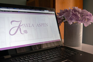
Furthermore, the logo was created based on the website name Kayla Aspen. At first, I used the different typographies to create my logo in different variations with the brand colors and ellipse tool. After, I realized that the logo needed to be timeless and memorable. I kept the Park Lane typography for the rest of the letters in the name except for the letter K. I used different paintbrush stroke styles to create the new K into the shape that I wanted with slightly jagged edges to blend in with the marks on the aspen tree and then I created a leaf that branches off from the bottom of the K which is in the shape of an Aspen leaf. I also used the paintbrush tool to create the shape of the outline of the leaf and veins, and then I created a pattern for the scales inside the leaf which I learned from Youtube. Additionally, I learned to create aspen or birch trees to add as an accent accessory in the background of the logo placement on the website with different hues and opacities.


After creating the style guide, I designed a website with a domain name set up through WordPress using the Divi Elegant Theme plugin which features different aspects of lifestyle including fashion, beauty, health, wellness, faith, about and contact pages, and a demo store for purchases. Each page has a unique set of sections designed to create the website layout using Divi.
On the home page, you will view the top bar with the secondary logo on the top left corner while the page menu is on the opposite side. Underneath that, you will see the name of the brand and a slide of recent blog posts. Below are featuring the different categories linked to those specific pages under the drop-down on the Lifestyle Blog menu. The next section showcases the recent products available for purchase which are set for demo purposes at this time. Furthermore, the section below splits off showing a vertical row giving viewers a snippet of the About page, social media connections, newsletter subscription, and a preview of The Wardrobe Starter Guide. Directly to the left of the vertical row are recent and trending blog posts. I added two simple posts to show how they would be viewed on the site. All posts are connected to their category, so each category has its page which will only show posts in that category. However, the Lifestyle Blog page will show you all posts connected to the featured categories.
The Home, Lifestyle Blog, and Contact pages all have a newsletter subscription. At the bottom of the home page, it has a social media slider featuring my Instagram posts and footer. All other pages also have an inverted version of the primary logo’s hue. The About page shares information about me with an image and has a module directing towards the blog or the store linked through a bottom on top of an image. The Contact page allows people to share their name, phone number, email address, and a message box that they can send to me. The Store page has a drop-down menu featuring the shop, the individual’s account, and cart. The shop, as mentioned before is being used for demonstration. Currently, there are 3 products available to choose from which images were used from Shein. However, these products are not available on their current website.
Conclusion
As a final point, I spent 210 hours researching and designing everything from typography and color schemes to website layouts and Divi module designs. This project has given me the opportunity to see a small portion of what it’s like to bring something that I am passionate about in real life. I hope to continue enhancing my abilities and skills to design more content for my brand in the near future and if you give anything a little bit of more time, it can always be made with more love.