
Ryan Doss Class of 2021
Visual Communication B.S. Senior Project

Project Overview:
Celeste is a child company of Photopharmics a research group centered on phototherapy or using light in medicine. Celeste is focused on phototherapy treatment for patients with Parkinson’s. Utilizing a tablet that displays light to trick the brain into thinking the sun is rising and producing dopamine; the main concern for those who suffered from Parkinson’s. My Senior Project was to work with the small agency, Axia Labs, to lead the project as a UX Designer, work with the client to do research, and create an app to pair with the light device and enable patients to complete their treatments with ease and delight. The project would include setting scope, planning for autonomy and content creation on Celeste’s side, and then design and execution of the mobile app itself. The final product was influenced by client perspective, medical professionals, personal research and expertise, and real audience testing. The mobile app is currently in use during their 3rd phase clinical trials. More information about PhotoPharmics and Celeste and their work can be found here.
Major Personal Takeaways:
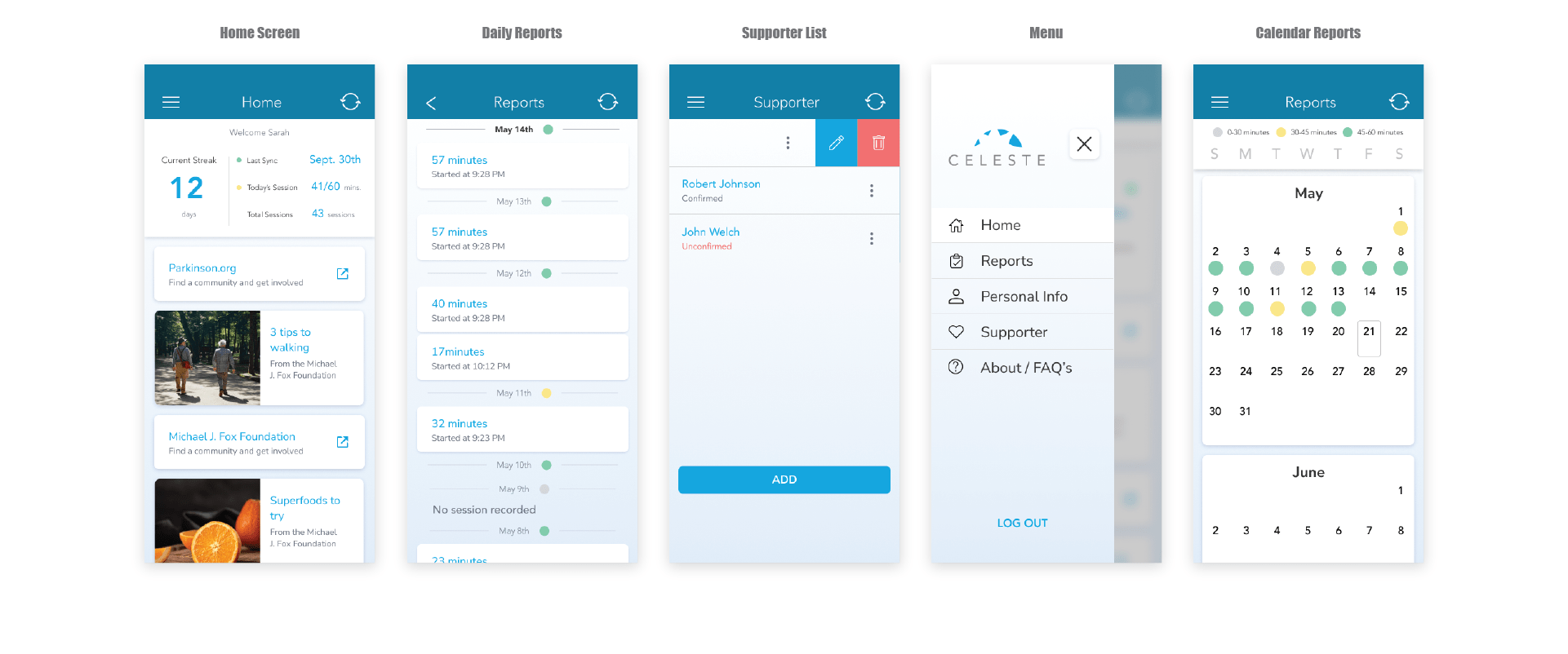
- The first will be the benefits of talking to a professional in the field of the product. I was able to speak to a medical professional in the field of Parkinson’s and gain an insight that had a direct impact on the design and ultimately the end-users entire experience. We see this specifically in the use of the swipe gesture to open the menu, move through content, and in the list items.
- There are times when the user flow is misunderstood and bringing clarity on all of the ideas from the client can create a new solution that is better than the original ideas brought to the discussion. We see this in the home screen including the content that was originally intended for a separate page titled resources.
Project Journey:
This section details the major steps and direction changes that occurred during the project from how it started, gained an initial direction, found course direction, made a few final key tweaks, and finally the finished product.
Square 1:
The first step was a meeting to learn more about the client’s needs. We discussed the overall scope of the project which included a simple list of features that needed to be included in the app and its main goals. I was in contact with Brett Walker from PhotoPharmics at the company and spoke with him directly alongside developer Rob Upchurch at Axia Labs. This is where I created a simple user journey ‘wireframe’ to affirm to Brett we were on the same page and able to begin making sketches at to some possible ideas. This user journey is shown below and represents covers just the main interests of the client in a basic form with a blue theme to take a guess at their theme.
Building a Style:
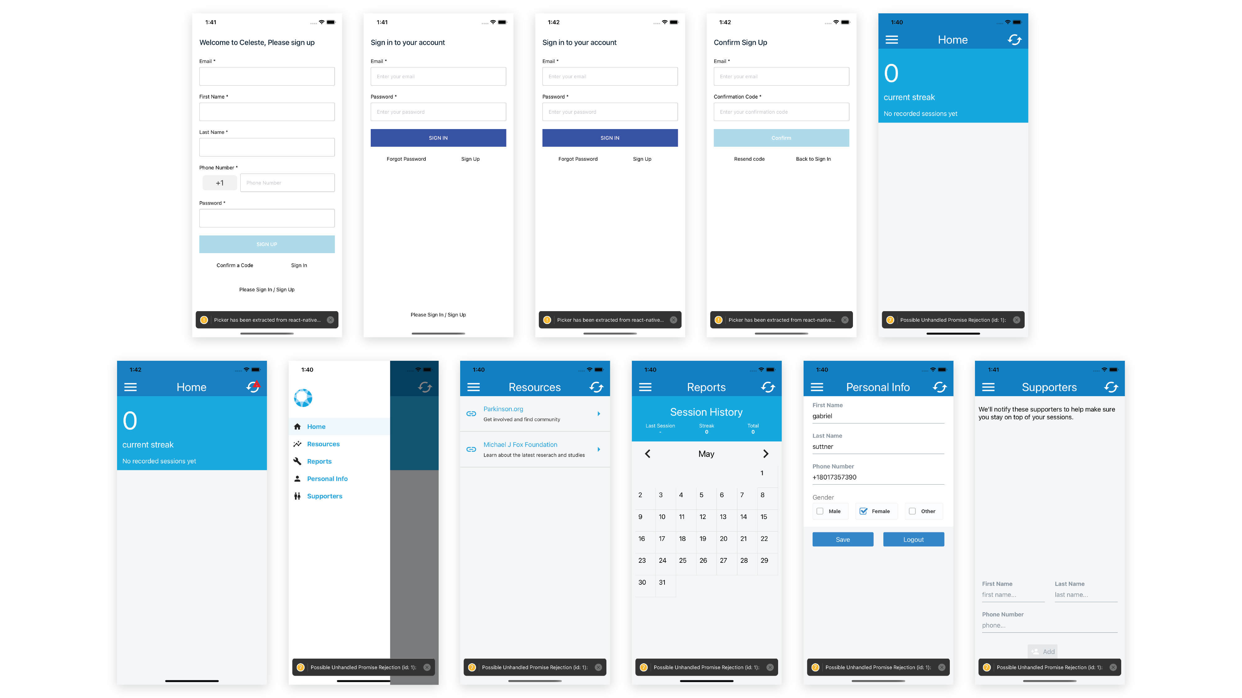
Before the next meeting, I was able to put together a low-fidelity mock for Brett to see what I was talking about and the general features/flow of the app. He gave us the go-ahead and we were given a brief and bare style guide that mostly related to print materials such as memos, business cards, and emails. there was a bit of back and forth but we were able to create a Version 1 of the application for another meeting with Brett. This was put together along with several notes on different styles but mostly features that pertained to the patient’s experience. The big points we wanted to cover at this point were:
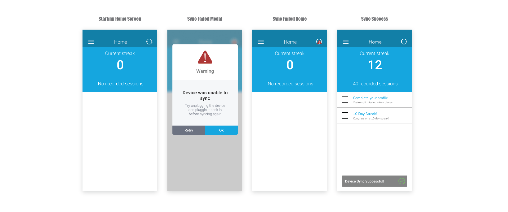
- helping the user understand their need to sync their device, what happens when sync fails, and how to troubleshoot.
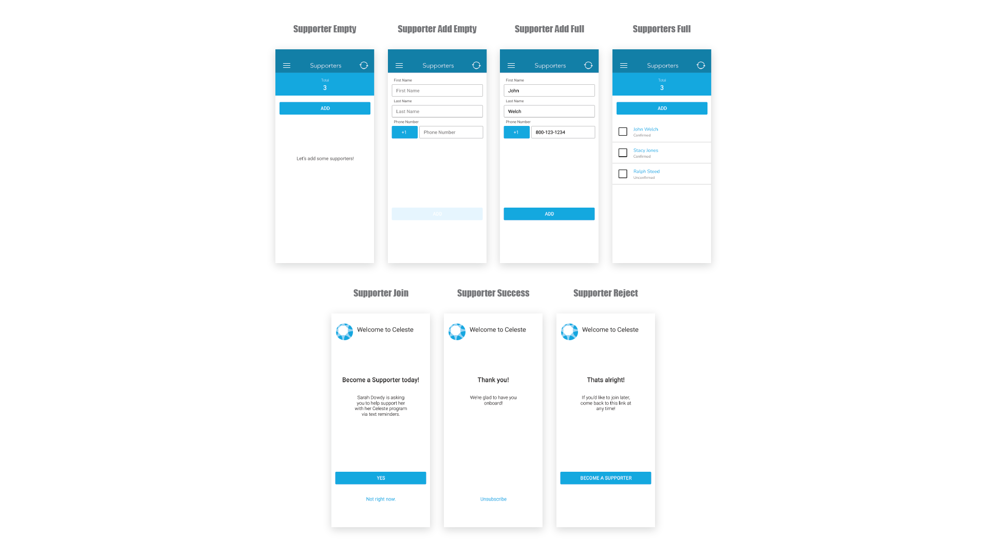
- The process of creating a new supporter.
- Some sort of way to log previous sessions and view them.
These 4 points were discussed at length with Brett. We were able to better understand in-depth the idea or vision he had in mind for the product. Below I have answered the question to each of these main concerns and provided the design from the V2 of the process.
1. The user would receive a modal that would force them to acknowledge that the device did not sync and recommend briefly restarting the device which was the most common problem. This would both alert the user and help them become the answer to the problem.
2. This flow needed to be better understood and how it would work in order to be able to wordsmith prompts to the would-be supporter and for the user as well. During the clinical trials the user would only be able to add 1 supporter because of the need to be private; however, once released the product would allow for multiple.
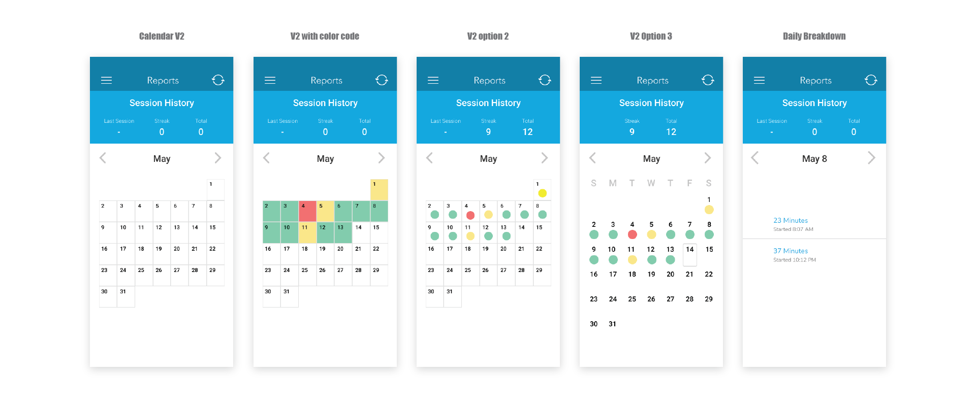
3. We worked through several ideas but after discussion with Brett on his particular interests in this calendar and its purpose. I was able to come up with a sleek design that utilized the color code method that made it clear how the patient was doing overtime.
Re-adjusting User Map:
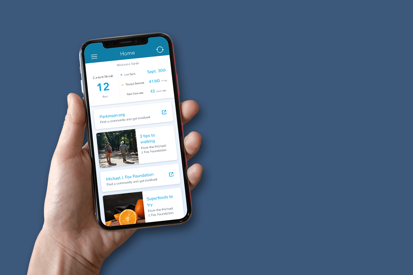
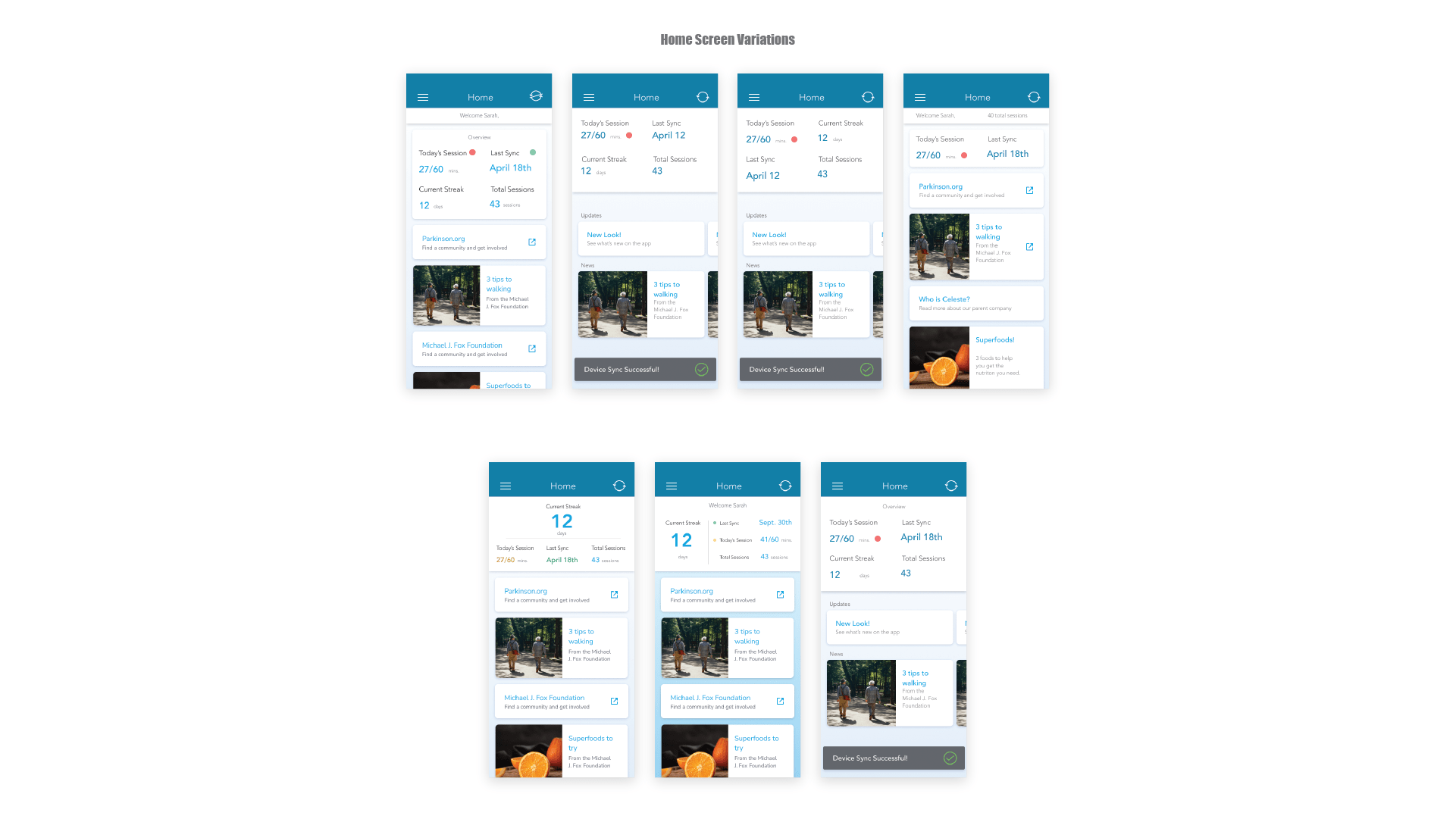
During a meeting with Brett, we dove deeper into the content of the resource page that Celeste envisioned. Determining what was possible between Rob and me for development and use of WordPress design we determined we could create a place for them to create a post within WordPress that would appear in the app. Once that was set in place we were able to look at the design again and I determined the home page would be a much better fit for this content allowing the user to see all sorts of articles and links on the front page while the patient was undergoing the treatment. From there we explored this idea of having swimlanes based on the conversation with Brett but ultimately determined there was not a large enough variety in content type to warrant the added complexity of the design. Also as I will discuss in the next section the more simple the design could become the easier to navigate the app would be for those with more severe tremors and symptoms from Parkison’s. The different design variations of the separated pages and combined iterations are shown below followed by the final design.
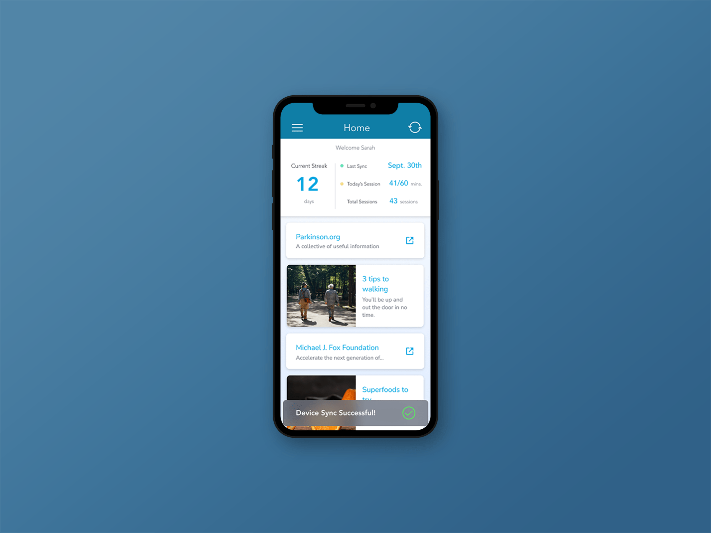
Final Design
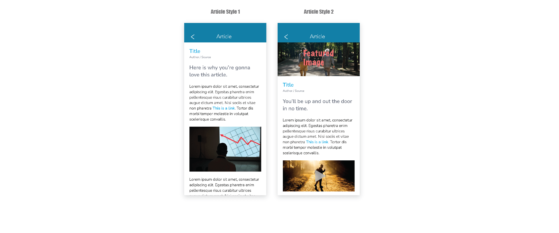
The design for what the article needed to look like also needed to be designed and these mid-fidelity mocks served to help Rob the developer produce these screens.
Empathetic User Breakthrough:
The shining hero moment in this project for me where I felt like I took my design and stewardship over the product to the next level comes towards the end of this process. I was able to put in time research design for those with physical impairment ie missing hands, deformity, and tremors. I tried to include this into the designs during the process, but with the help of Brett, I was able to talk to a medical professional and have a long detailed conversation about Parkinson’s and technology. I was able to prepare for the interview and have particular design pieces that I could ask her about. For example, based on the audience I made the correct assumption that users were going to be using 2 hands and their pointer finger to operate their phone rather than one hand using their thumb. I wanted to know more about touch boxes and sizes that would work but still maintain a respectable size so as not to offend the user. The key piece of information though came from discovering that in general, tapping your finger on the screen is a fine motor function. Fine Motor Function signals are sent through the brain via Dopamine, which as stated earlier is in low supply for those suffering from Parkinson’s; however, swiping gestures, like scrolling or moving left or right are gross motor functions that require less effort and is more readily accomplishable by our target audience. This clued me into adding swiping and scrolling into several places in the app as well as the use of a large card style which is a large tap zone but doesn’t make the user feel like a child. We see it on the home screen, it also allows the user to swipe to get to the menu, and work through the calendar section. I also added the swipe gesture to the list items in the supporter’s section as well. Below I have shown where some of this added functionality which has no addition to design however greatly increases the usability for the patient. We were able to do simple user testing with 2 individuals with moderate severity of symptoms. The heat maps, touchpoints on the screen, and time to complete the task were 70% faster with the design that allowed the user to swipe to see the menu. This leads me to better understand that sometimes the best design is in fact invisible to us.
Final Design Journey:
Here I wanted to showcase the final design by walking through the design decisions in a video found here
Concluding Thoughts and Reflections:
the biggest difference I have encountered with UX and UI design to date is this one. the difference I was able to see when I stepped back and took time to really get into my user’s shoes, understand the trials they experience on their journey to accomplish a given task, that design needs to be invisible. It needs to have buttons big enough to be easily pressed but not so large that a user is embarrassed or feels like a child. This looks like making pressable links into individual cards that use better spacing and larger touchpoints with purpose. Overall I feel grateful to work on a fulfilling project that helped those who are suffering now get one step closer to normal by using my skillset. This project showed me I can have a huge impact on the daily life of others as I do my research, prepare, test, and pay close attention to the small details.
Contact Info
Email: Ryan.and.Doss@Gmail.com
Time Spent on Project:
- Research: 10 Hours ( personal study of design and Parkinson’s, discussion with Medical Professional, User Testing)
- Design 50 Hours ( sketching, v1, v2, v3, and development assistance)
- Meetings 10 Hours ( With Brett for check-ins, design review, scope understanding, and with Rob for development )
fin